Untaboo
Helping women manage their period while traveling
Team
- Joshwin Greene
- Dorothy Ho
Roles
- User Research
- UX Design
- Usability Testing
- Presentations
- Stakeholder Workshops
Tools
- Precursor
- Sketch
- Invision
- Axure
- Mural
Duration
- 4 weeks
Overview
Introduction
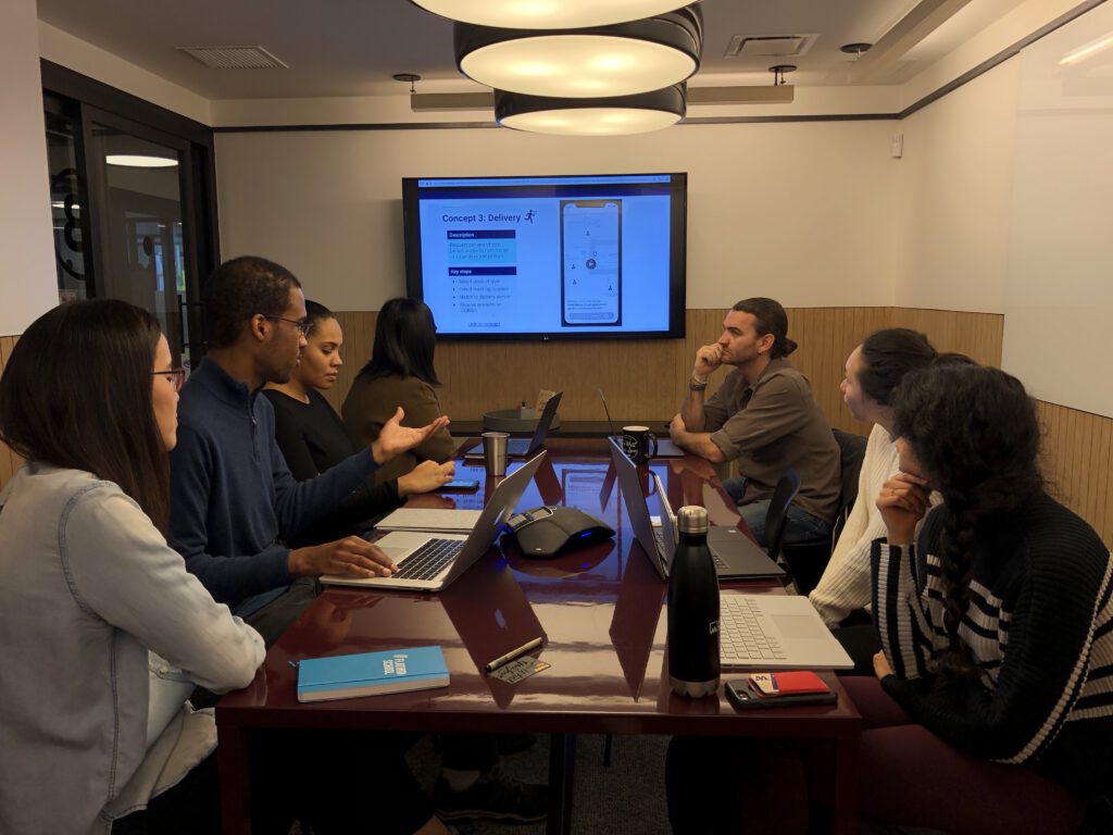
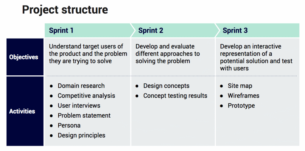
My teammate and I worked through a user-centered design process over the course of 4 weeks (3 sprints) that ultimately resulted in a volunteer-oriented mobile solution that helps women travelers obtain period products when they unexpectedly find themselves on their period without tampons / pads on them.
The most immediate goal that was asked of us in the brief that we were given was the following:
“Design an app that would provide access to aggregated menstrual health content”
As the project went along, the problem that we would ultimately solve for changed to the aforementioned problem that women travelers face.
Background
This was my last Flatiron School project. For reference, Flatiron School offers various types of bootcamps, such as UX/UI Design, Data Science, and Software Engineering.
For this project, we were given a client to work with.The client’s name was Rachael Kim and she’s the CEO of Project Untaboo. The project came about because of a partnership between Project Untaboo and WeWork Labs (WeWork owns Flatiron School).
How Our Work is Being Used
The result of this project is now being used to develop an MVP of the project. Besides starting development of the MVP with her team of developers that she sourced from WeWork Labs (the developers were past Flatiron School students), she also passed our work to the UI Design team that was a part of the cohort that came after mine.
Kickoff & Process
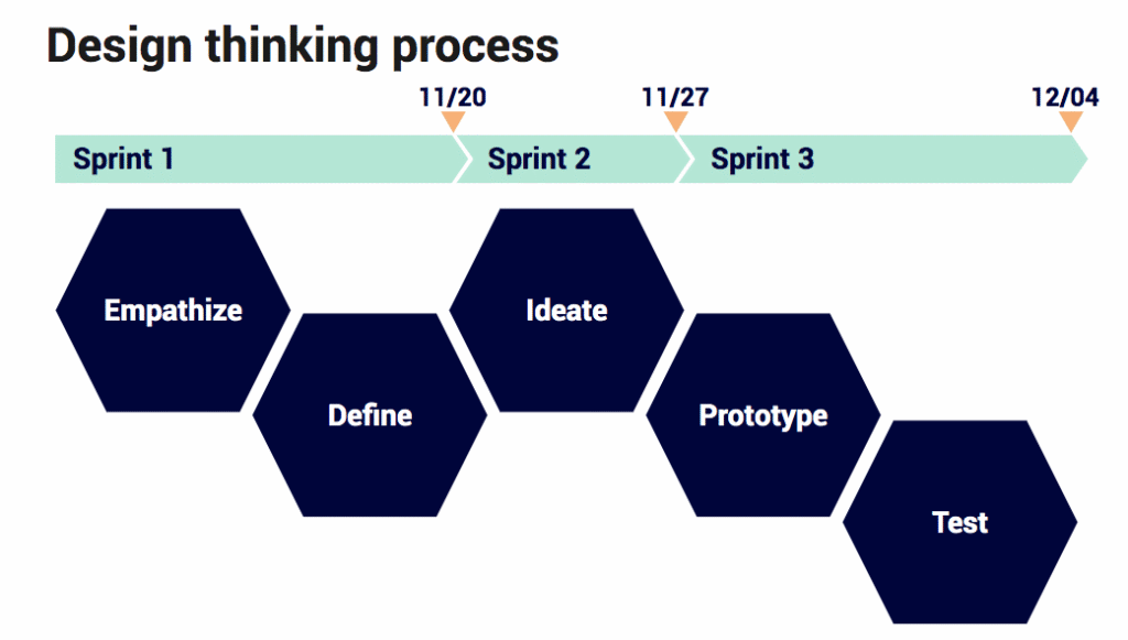
During the project’s kickoff, we outlined our user-centered design process and planned project structure to the client.
Empathize & Define
Research Objective
In general, we had the following research objective:
“Understand the resources (information and product) users currently use to manage their menstrual health and challenges they have encountered, especially when traveling.”
The Domain
One of the first things we started off with after planning our research was doing an analysis of what’s going on in this domain. Besides focusing on where women get information when trying to answer menstrual health questions, we also eyed (1) what was trending, (2) the sustainability side of period products, (3) the new purchasing options women have for these types of periods, and (4) the topic of period equity.
Here were the results:
- People are more open about menstruation
- The Femtech market is forecasted to be worth $50bn by 2025
- Proliferation of period tracking apps, but gender stereotyping is an issue
- Many eco-friendly sanitary products are now available, like reusable menstrual cups
- Customizable period, sex, and self-care subscription box services are now a thing (ex. LOLA)
- Many women in developing countries still face adversity when it comes to accessing menstrual information and relevant facilities
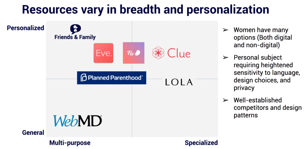
Competitors
Using the brief and the results of the kickoff meeting as a guide, we identified the following competitors and key takeaways:
Interviews & Findings
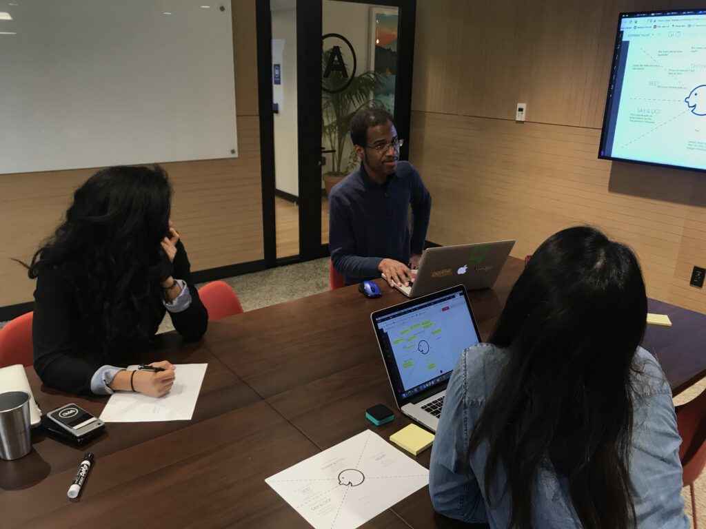
In total, we interviewed one Subject Matter Expert (SME) and 8 users over the course of four days. For reference, every participant was selected by our client. This fact is important because the client identified a 20-something year old female student on a gap year as being the first type of user that came to mind in an Empathy Map activity that we conducted at the end of our kickoff meeting. However, the median age for the user interviews was 30. So, there was a disconnect here on who she was primarily targeting.
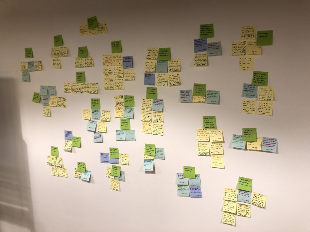
After conducting these interviews, we used affinity diagramming in order to identify the major themes from the insights that we gathered. Using the results of this activity and specific data points from our user research, we were able to distill and present a number of participant characteristics and takeaways to our client.
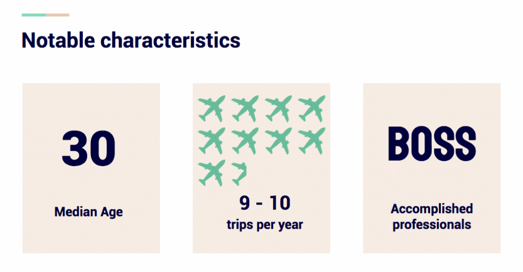
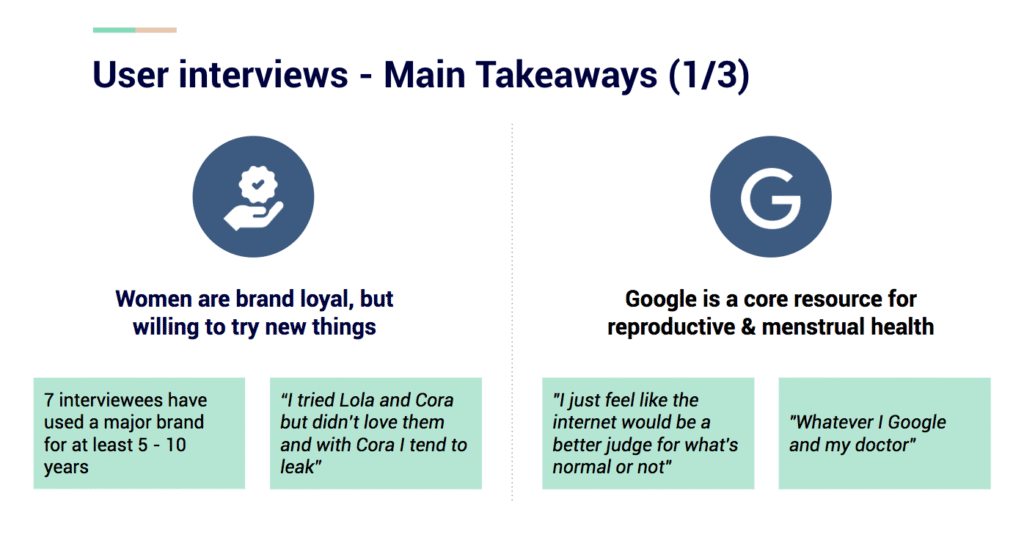
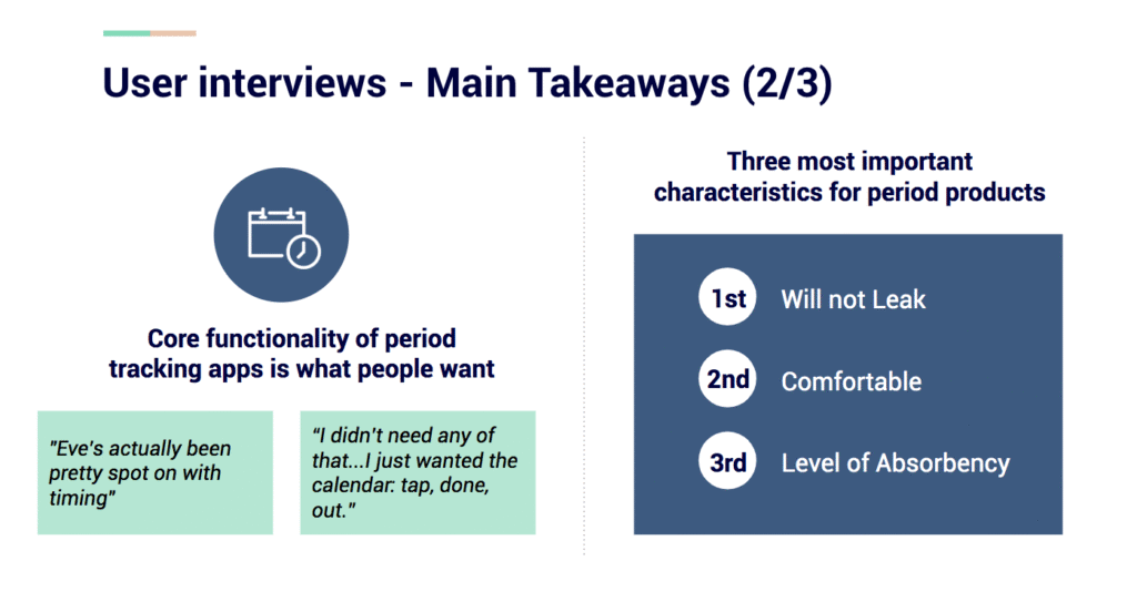
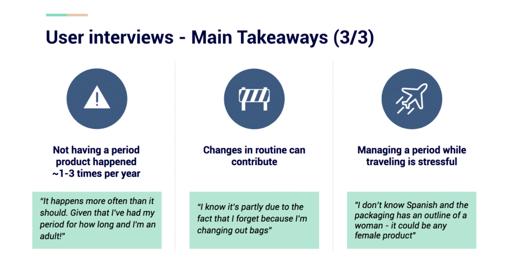
Based on some early data, I suggested that we could split up the personas based on who was prepared for the unexpected situation of being on your period when you least expected it. However, when comparing the data from all of our sessions, we could see that everyone had their period management routine down to an extent. Besides that, we could see that were two characteristics that was represented heavily: professionals and travelers. So, it made sense to create two personas that were representative of these characteristics.
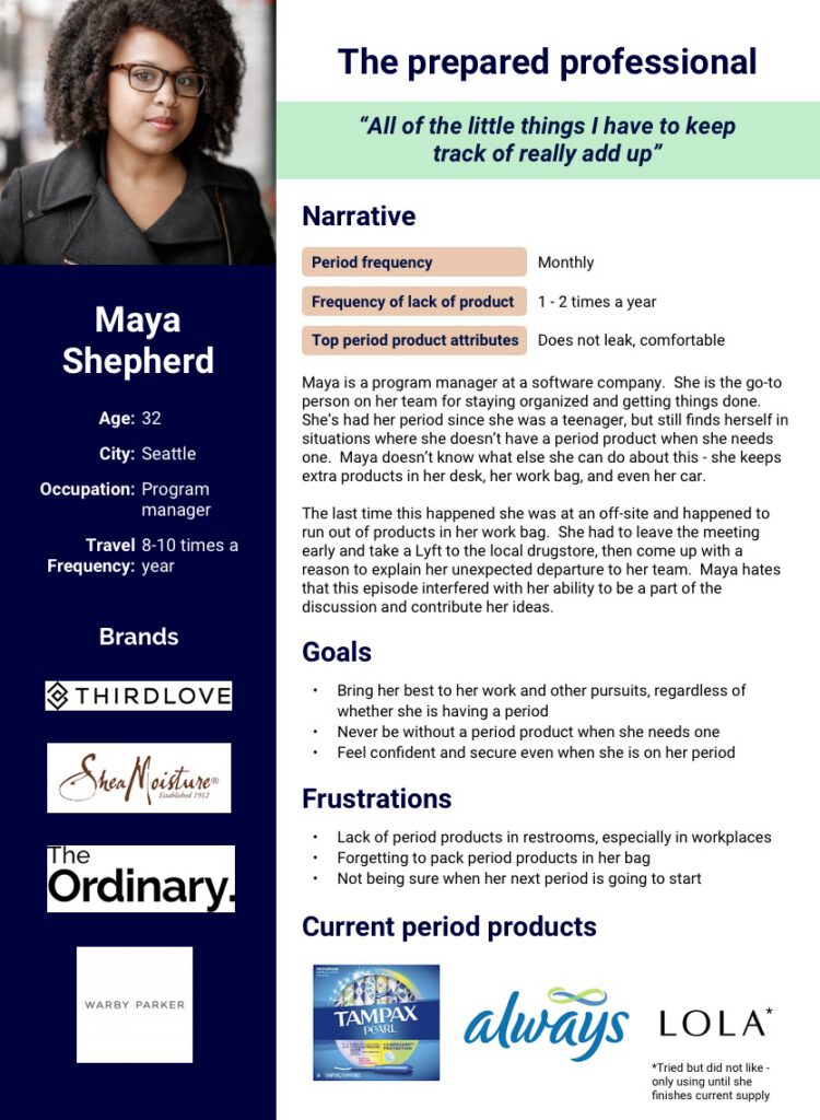
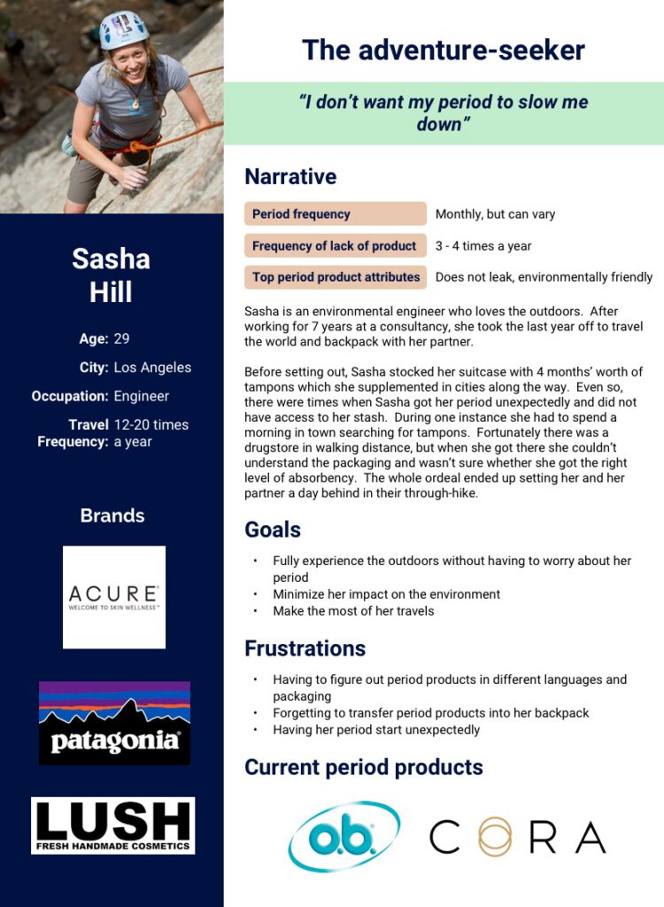
When we brought these personas back to our instructor, he stated that these personas weren’t different enough to be kept separate. The qualities from both of these personas could represent a single person.
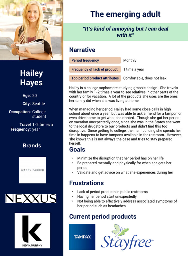
Based on this feedback, I suggested that we could combine them. However, based on the lack of time that was available, we decided to focus on creating one more persona that was based on an 20 year old participant that represented an outllier in our data. Even though this isn’t a recommended approach, we wanted to show this persona to our client along with the above personas in order to understand whether the client wanted to target this type of individual or just focus on older travelers and professionas. Based on how the client brought up a 20-something year old gap year traveler during our Empathy Map activity during the kickoff meeting, this would be a key decision.
Here’s the persona that we created for this participant:
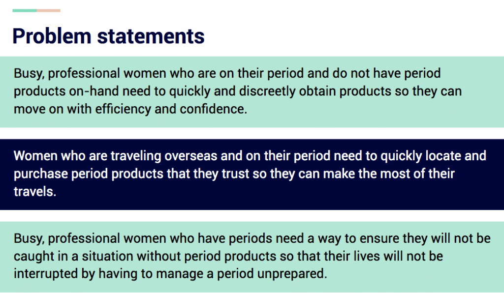
We were also able to create three problem statements. For the problem statements, we individually brainstormed them and then came together and aligned on the three statements that we would move forward with.
We also came up with design principles as well. We used the same brainstorming protocol when coming up with them.
Here they are:
Design Principles
- Sophisticated and sleek: Product respects the maturity and refined taste of users
- Private and purposeful: Product only asks for data that can be used to the clear benefit of users – value is described and not assumed
- Straightforward and streamlined: Information is presented clearly and succinctly, without jargon or slang; core functionality is accessible immediately
- Actionable and personalized: User receives recommendations about specific steps she can take to help manage her period
- Reliable and relatable: Information is medically accurate and relevant to user’s concerns
Alignment with Client
Here’s what happenned during the first sprint update meeting with the client:
- Client said that our user takeaways were in line with the research that she did
- Chose the Maya and Sasha personas when we presented the rationale for the personas, but said to keep Hailey in mind
- Chose the second problem statement since she wanted to focus on travelers
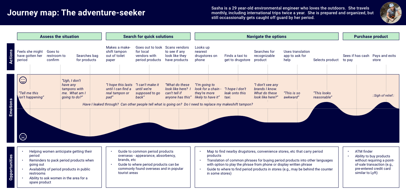
- Lastly, we used a journey map In order to help everyone get a better understanding of what our persona would experience when dealing with the chosen problem statement.
Ideate
Concept Generation
Now that we had the user archetype, problem, and journey in mind, it was time to brainstorm solutions that would help Sasha/Maya resolve this problem while traveling in an unfamliar land.
We came up with 3 mobile concepts. Here they are:
Concept 1: Beacon
Description
Send out a request to local app users for a free period product in an emergency
Key steps
- Select product type
- Review results list
- Send message
- Coordinate meeting location
Concept 2: Guide
Description
Explore and find the top tampon/pad brands that are offered in foreign countries
Key steps
- Select country/city
- Select filter
- Select period product
Concept 3: Delivery
Description
Request delivery of paid period products from locals in a cashless transaction
Key steps
- Select product type
- Select meeting location
- Match to delivery person
- Receive products at location
Concept Testing & Findings
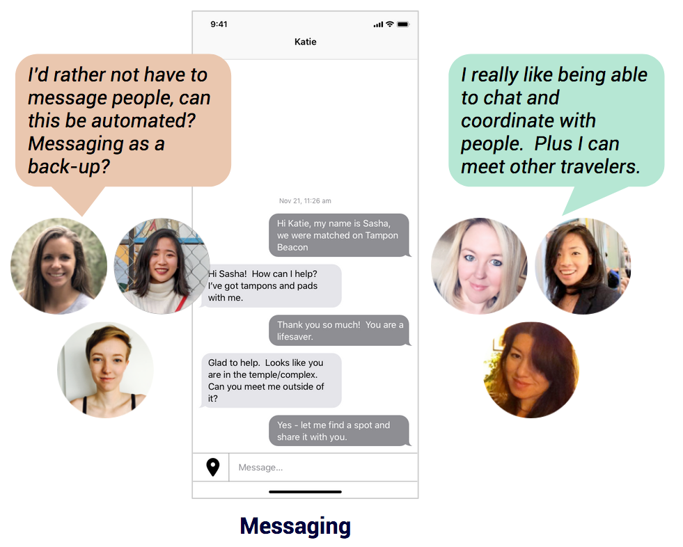
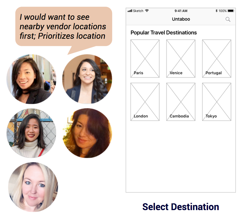
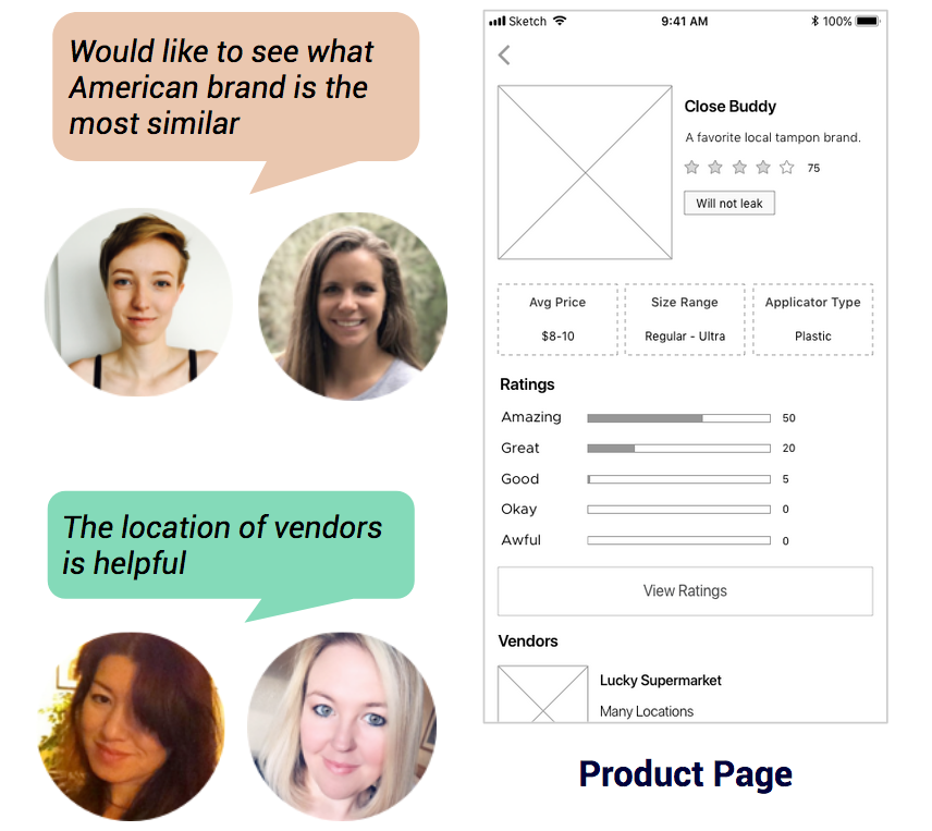
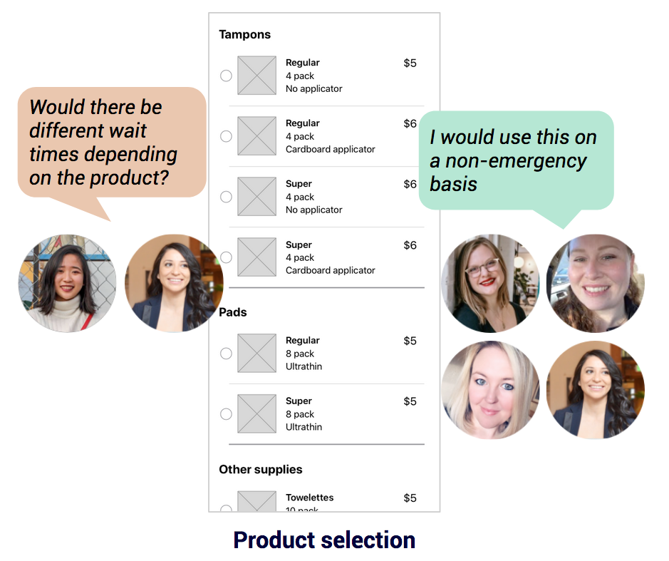
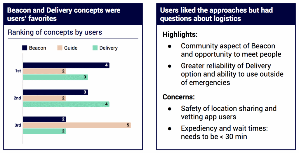
We held 9 individual concept testing sessions in order to see what people thought of each concept, if there were any navigation problems, and how they would rank all three concepts.
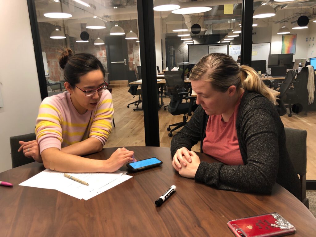
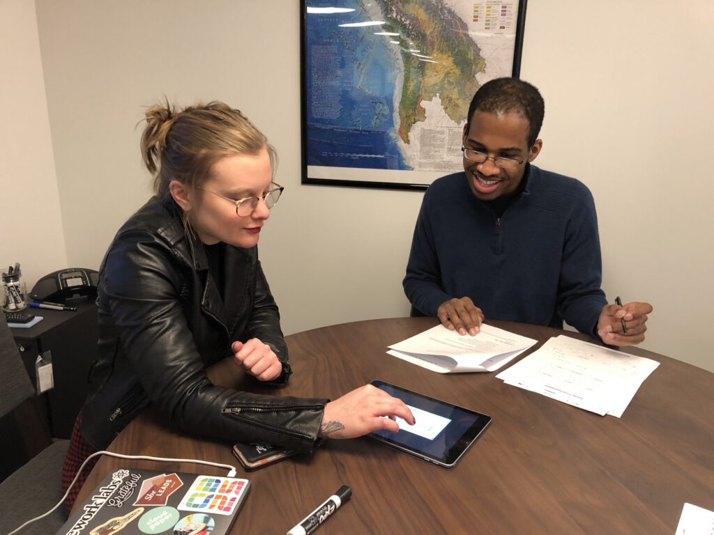
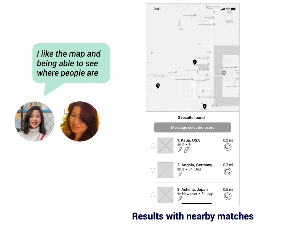
Here were some of the highlights for each concept:
Concept Testing – Beacon
Concept Testing – Guide
Concept Testing – Delivery
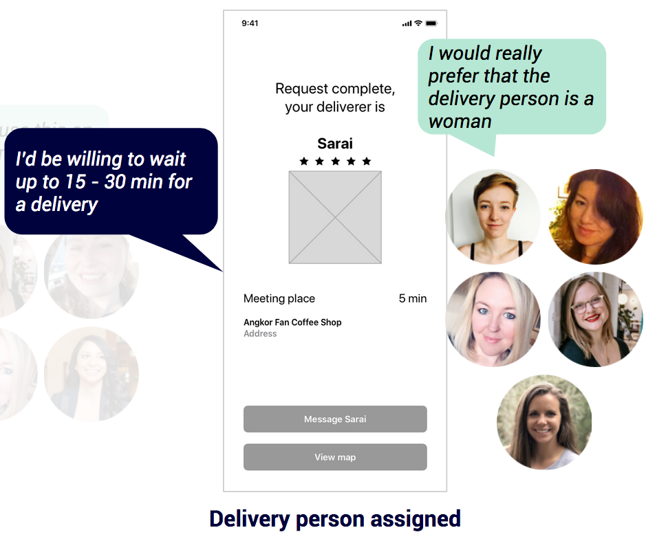
Conclusion: Beacon and Delivery emerged as the clear leaders
Alignment with Client
After presenting the above concepts and findings to the client at the second sprint update meeting, we asked what concept she wanted to move forward with.
In order to help her make this decision, we prepared some thoughts from our perspective, like those related to monetization, community, and competitive risk.
Here’s the graphic that we used when we went over these thoughts with our client:
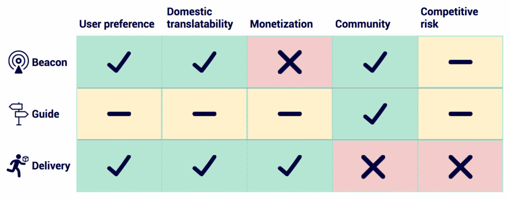
In the end, the client chose to move forward with the Beacon concept. She wanted to support both the domestic and international angles. For the international angle, she also wanted there to be some type of translation capability so that users that spoke different languages would be able to communicate with one another.
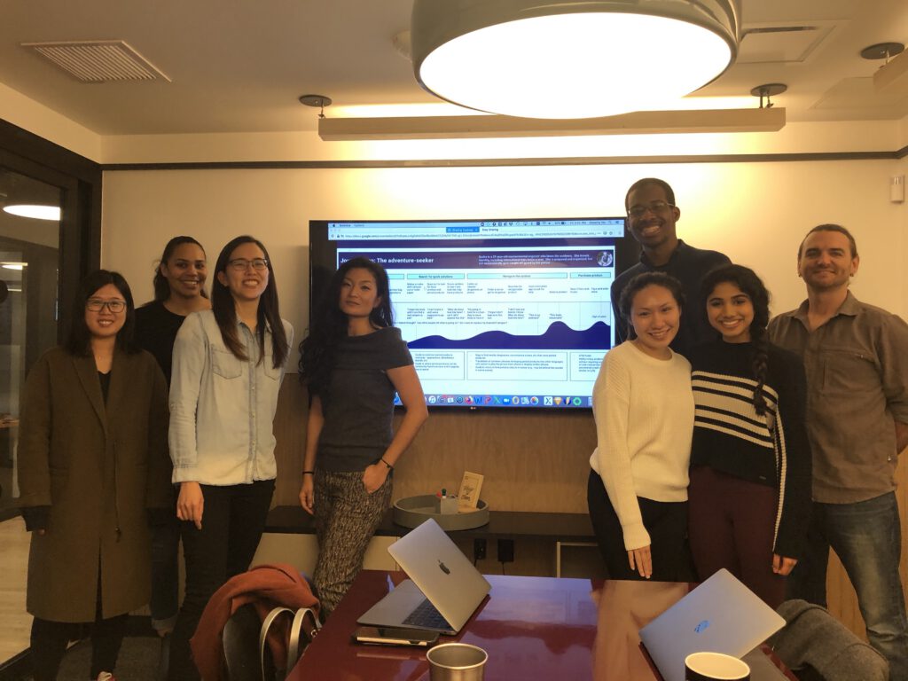
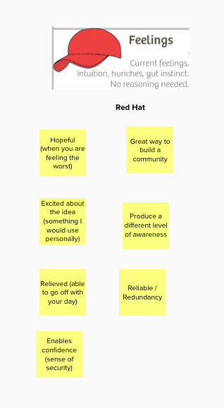
At the end of the meeting, Dorothy and I co-led a 6 thinking hats activity. During this activity, we had the client and her teammate think about this endeavor from different perspectives. Here’s a full picture of the results and a snapshot that you can read:

Prototype
User Stories & Task Flows
With this major hurdle behind us, we moved onto creating user stories and the associated task flows.
Based on the results of the last sprint update meeting, we knew we needed to create user stories for when the user makes a tampon/pad request domestically and internationally. For the international request, we also knew that this needed a translation component.
Using this information, we created the following user story assignments (each area could include one or more user stories):
Joshwin
- International Request (including the translation component)
- Meeting Location
Dorothy
- Domestic Request
- Request Received
Note: For each user story, the assignee would be tasked with the creation of the associated task flow.
Here is what we put together after getting feedback from each other:
International Request (Joshwin)
User Story
- As a user who needs a period product in a foreign country, I want immediate access to period products as I’m dealing with an emergency and don’t have the time to personally figure out where to purchase these products.
Task Flow
Choose period product ⇒ See search process (distance slowly increases) ⇒ See nearby app users who could help ⇒ Select one or more users ⇒ Select a meeting location from a list of recommended locations (as a suggestion) ⇒ Select a time frame (as a suggestion) ⇒ Send request
International Translation Capability (Joshwin)
User Stories
- As a user who needs a period product in a foreign country, I want a way to easily and politely communicate with those who don’t speak my language so that both myself and the helper can easily go about the exchange.
- As a user who needs a period product in a foreign country, I want a non-stressful way to communicate with those who don’t speak my language so that my apprehension of messaging people doesn’t get in the way.
Task Flow
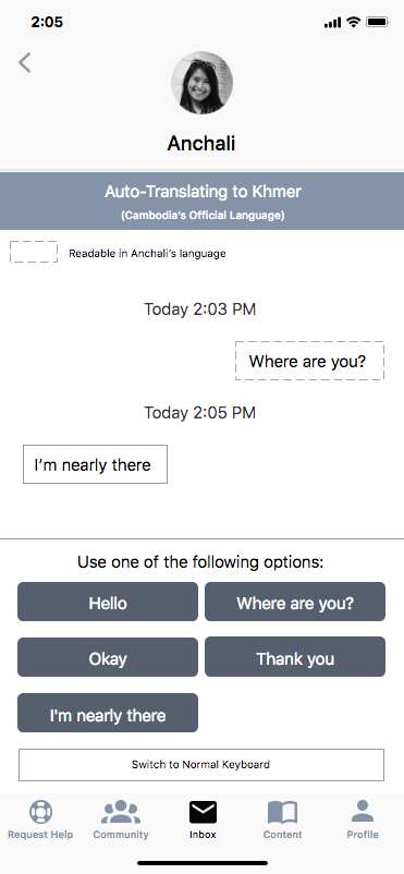
Tap on Messaging CTA ⇒ See message dialog box ⇒ See auto-translation options (“Hello. I appreciate the help.”, “Where are you?”, “Where can I buy period products here?”, “Thank you”)
Note: I came up with this idea based on how I played an online game in the past that offered auto-translation capabilities. it allowed me to be able to communicate with Japanese players.
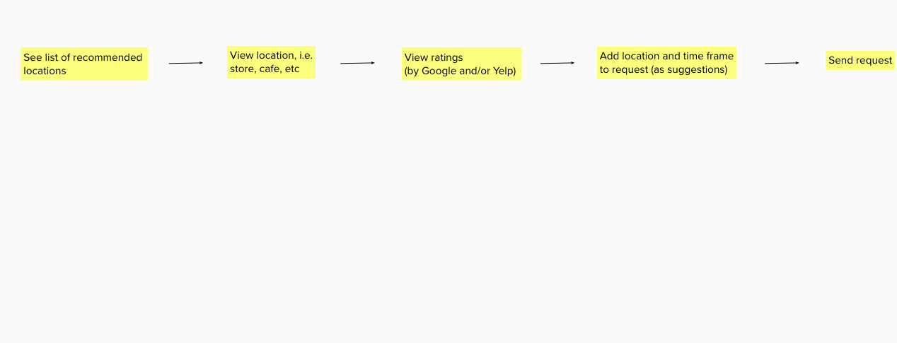
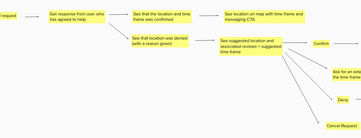
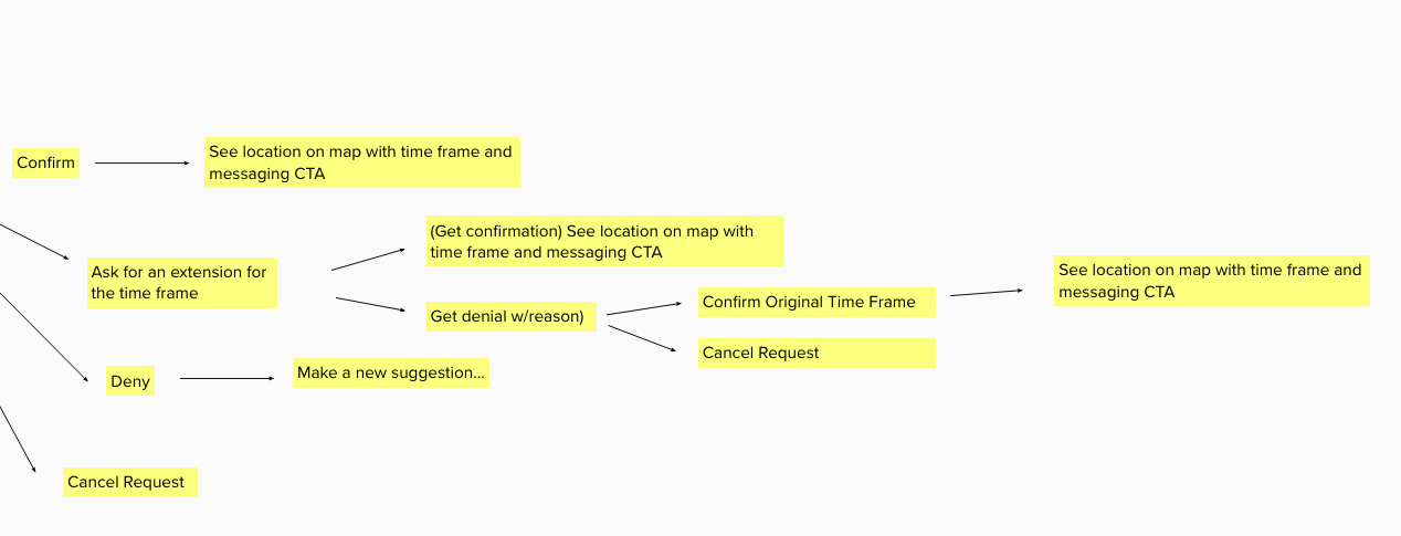
Meeting Location (Joshwin)
User Stories
- As a user who needs a period product in a foreign country, I want a way to ensure that I’m meeting people in a safe location so that I can have a peace of mind when I’m making the exchange.
- As a user who needs a period product in a foreign country, I want a way to ensure that I’m meeting with people who I can trust so that I can have a peace of mind when I’m making the exchange.
- As a user who needs a period product in a foreign country, I want a way to meet with those close to me so that I don’t have to go out of my way in order to get the period product that I need.
Task Flow
Domestic Request (Dorothy)
User Stories
- As a member of the Untaboo community I want to know when someone needs a period product so I can help them in a difficult situation.
- As a member of the Untaboo community I want to know the type of product the requester needs so I can determine whether I’m able to help her or not.
- As a member of the Untaboo community I want to know how far the requester is so I can determine whether I’m able to make it to them in a time and with a mode of transport that will work for me.
- As a member of the Untaboo community I want to know how urgently the requester needs the product so I can determine whether I’m able to help her in a time frame that will work for her.
- As a member of the Untaboo community I want to know the requester can be trusted so I can stay safe while trying to help someone.
Task Flow

Request Received (Dorothy)
User Stories
- As a user who needs a period product I want to know how long it will be before I can get the product I need so I can decide whether I need to pursue another course of action.
- As a user who needs a period product I want to know if I’m able to get the kind of product I can use so I can decide whether to use Untaboo or find another solution.
- As a user who needs a period product I want to know where I have to go to get the product so I can decide whether this option will work for me and make any necessary arrangements in my schedule.
- As a user who will be meeting a stranger to get the product I need, I want to know I can trust the person helping so I can stay safe while getting the help I need.
Task Flow

Wireframes & Final Core Task Flows
Once the above flows were completed, we moved to constructing the associated wireframes.
This is how we broke this up:
Dorothy
- Domestic & International Request Flow (start of process and up to when the user chooses their current location as the meeting location)
- Request Received Flow (how other users get the requests that are broadcasted by users that need help)
Joshwin
- International Translation / Messaging Flow
- International Request Flow (when the user chooses to meet at a location that is recommended by the app)
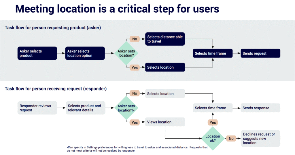
While creating these wireframes, it became apparent that the step where the user chooses the meeting location was a crucial part of the process. So, the request and request received flows revolved around this choice.
Here’s the final task flows for these two flows:
Axure Prototype
After creating our wireframes in Sketch, we migrated them over to Axure and hooked up the prototype in preparation for the usability testing that would be done.
Note: Invision was used temporarily for screens that had not been migrated to Axure yet.
Here’s the resulting prototype (organized by task flow):
Task Flow 01 – Product Request
Task Flow 02 – Response
Task Flow 03 – (International) Request & Setting meeting location
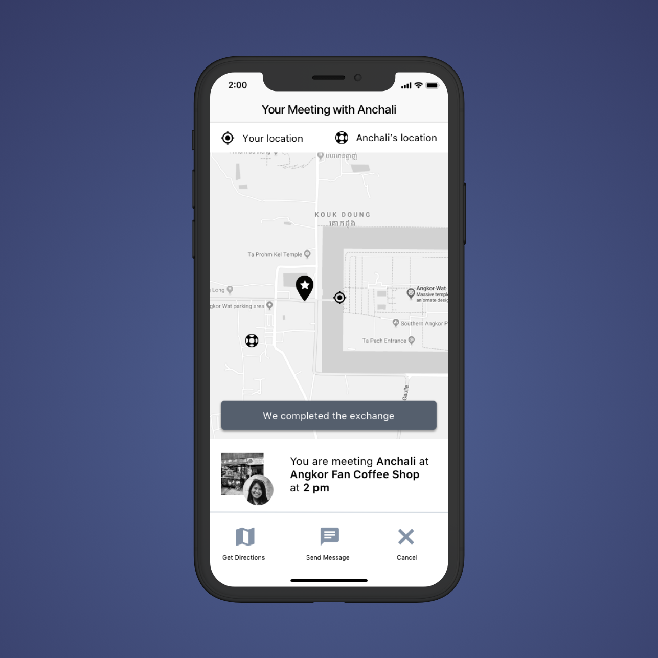
Task Flow 04 – (International) Meeting your Helper & Messaging
Description
After getting a confirmation, meet them and message them if there are any issues.
Key steps
- Get confirmation
- See map
- Send message
- Confirm the exchange was made
Alignment with Client
We used the “I like…I wish…What if” activity in order to give some structure to the portion of our meeting where we asked our client for feedback in regards to the above protoypes that we showed her.
Here’s an overview of what she liked and what she thought could use some improvement:
What She Liked
- Auto-Translation Feature
- How we displayed an establishment’s Google rating and other info
- Straightforward, Clean, Simple
Opportunities to Improve (based on the client’s questions)
- “Could we reduce the number of steps in the request and response flows?”
- “Could we make the purpose of the Inbox tab clearer?”
Test
Usability Test
We integrated the client’s feedback into our usability tests. This is what we wanted to test:
Request and Responder Flows
Rationale
The is the crux of the app. So, we wanted to test whether the flow made sense to people and if the process seemed too long.
Relevant Images
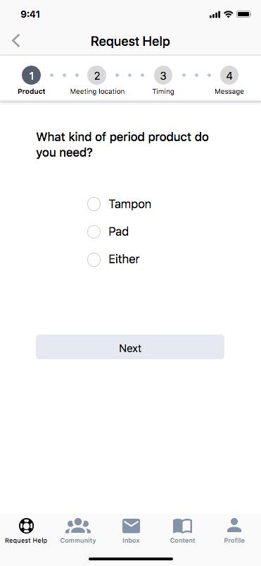
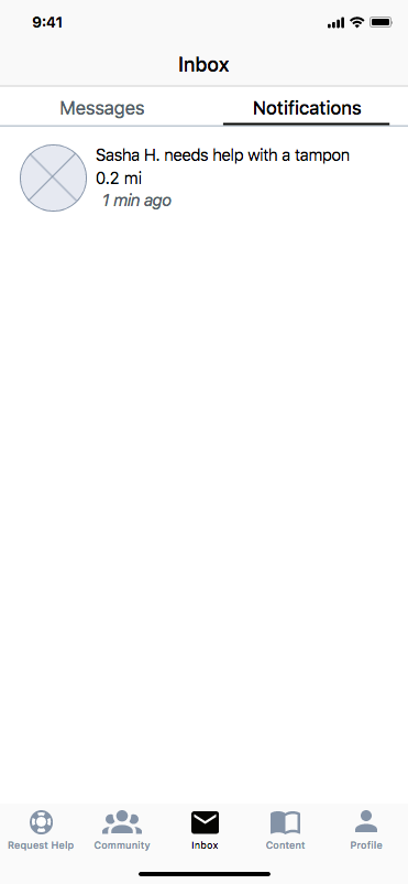
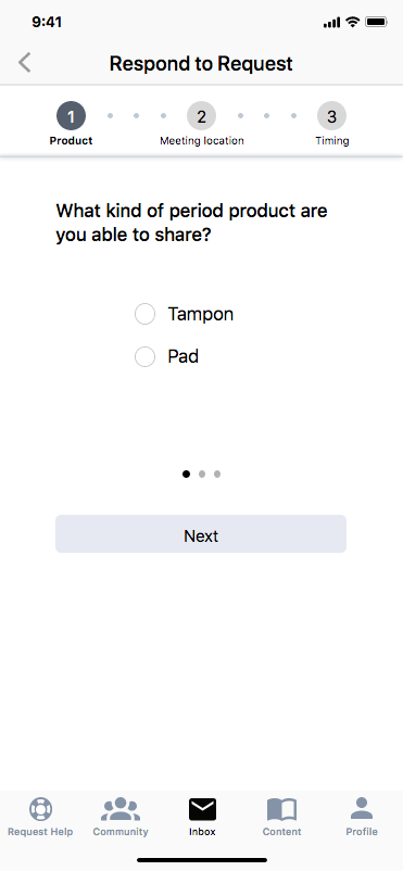
Choosing who will help you
Rationale
Besides testing the flow, we wanted to test whether people were able to understand what the circled numbers on the map represented.
Relevant Image
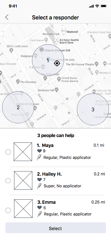
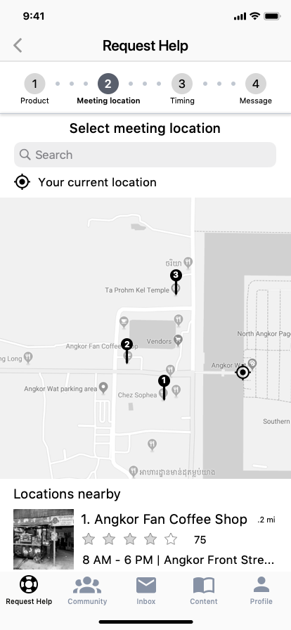
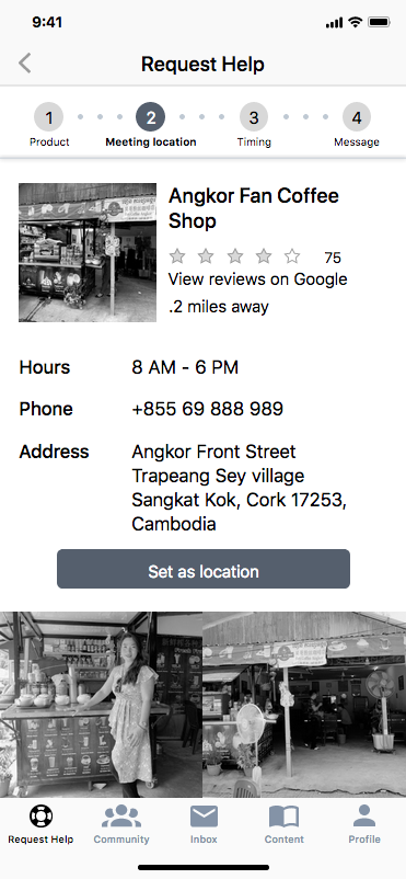
International Version – Choosing where to meet
Rationale
We mainly wanted to see whether the presented information about a location would allow the user to gauge how safe the location was to meet with a stranger in foreign location.
Relevant Images
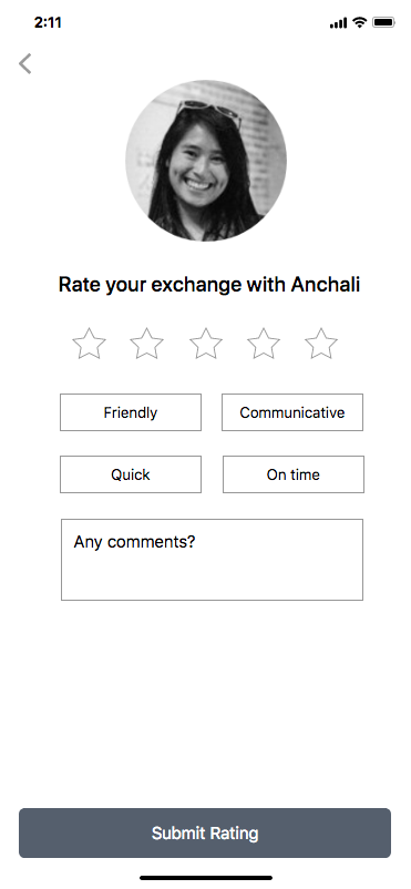
Auto-Translation Messaging Feature & Rating Screen
Rationale
We wanted to see if this feature and the rating screen made sense to the user.
Relevant Images
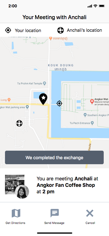
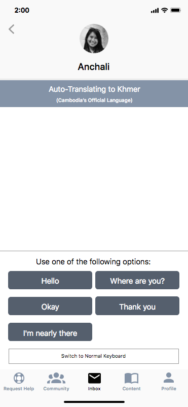
Besides testing these items, we also had pre and post-test questions. Here’s a quick glimpse:
Pre-Test Questions: Asked for the participant’s age, how often they traveled internationally, current occupation, and etc
Post-Test Questions: Asked for their favorite / least favorite part about the prototype, what would they change, and etc
During each of the four usability testing sessions, we would switch up who was the interviewer and notetaker. Dorothy was the interviewer for the first two whereas I was the interviewer for the remaining three (includes the rating screen). We made small additions to what we tested as we went along.
Findings & Recommendations
Here’s a quick video of our findings and recommendations for the project moving forward:
Style Guide
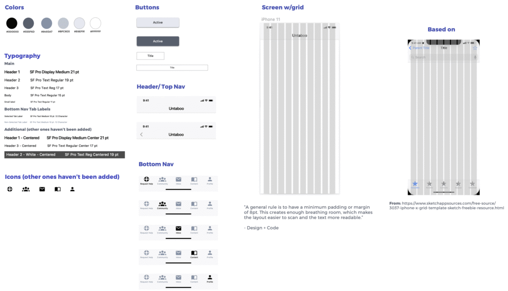
Here’s the style guide that we prepared for the client (we used Sketch):
Final Hand-off Meeting
For our final meeting, the client invited us to one last meeting where she and her team would be in attendance, which included the developers that she recently brought onto the project.
During this meeting, we did the following:
- Gave an overview of what we did during the project in order to help get the developers up-to-speed
- Covered our findings and recommendations from the usability testing sessions
- Answered any remaining questions that people had about the work that Dorothy and I did
